Target Optical Eye Exam Overhaul
Overview
Issues
My Complaints:
- Too Empty: There is a lot of wasted space on the pages in the flow; too much white space. It leaves the user feeling a little empty, as if there are parts of the site that are not loading.
- Lacking Information: The amount of information that is given to the user is low. It doesn't give the user any confidence. Target is all about making their customers feel like they are in a comfortable space.
- Appointment Availability is several steps deep: Currently, to look at the available times for a location the user must select a location, then select the day they want, then click the time arrows to see if the store has the time they want available. If there is nothing available they must either select a different day or go back to step 1, with no guarantee that the other location will have that time either.
Solutions
Search Results [before]
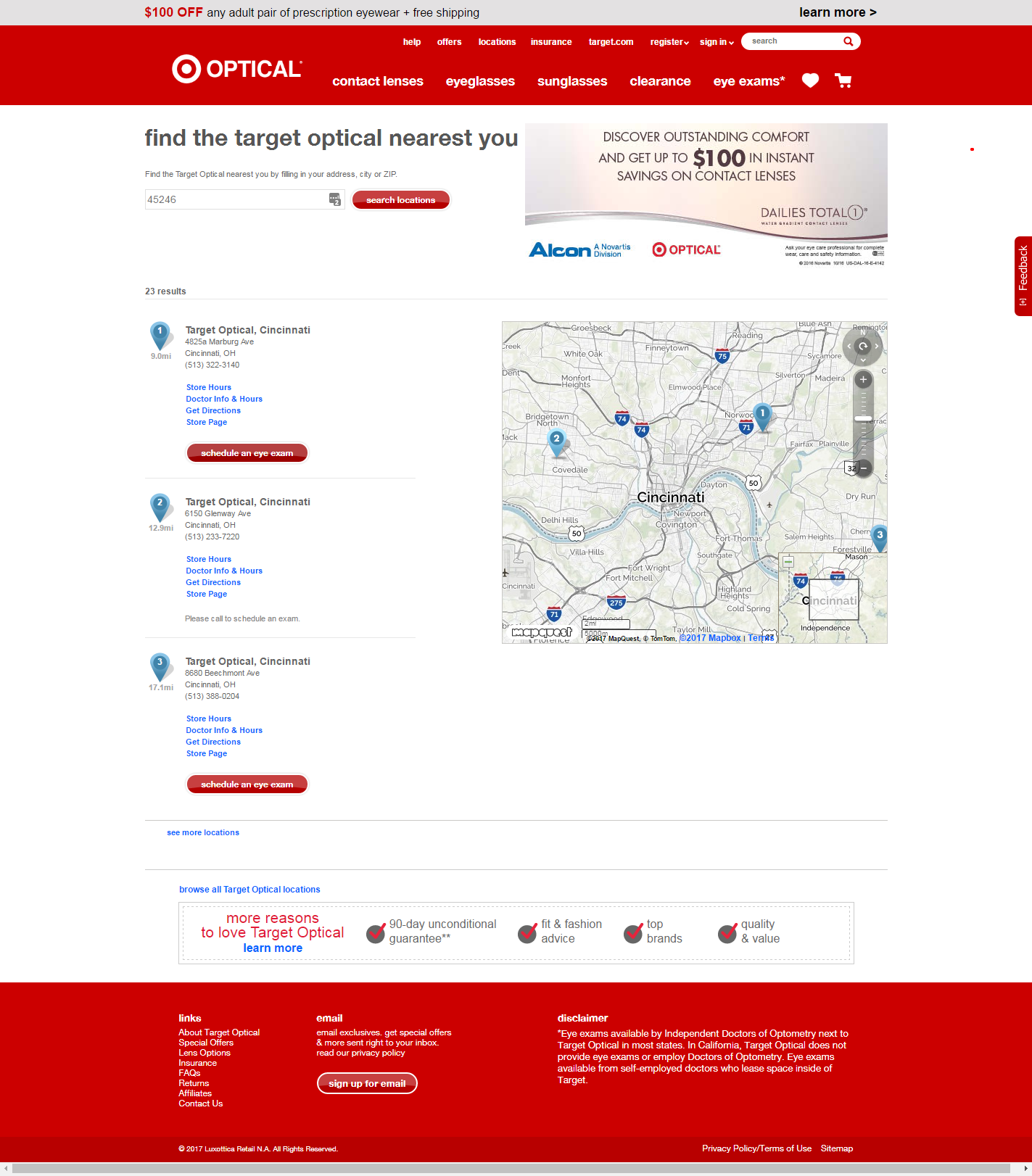
Current look of the flow
- Results feel short
- Unable to adjust width of search area, no indication of how big an area its searching
- Unable to filter results or indicate preferences (language, new patient, contact lens specialty, pediatrics, ect)
- Unable to see exam availability, only if the location does not allow booking online
- Map is small and can be hard to see, but takes up way too much of the page space
Search Results [after]
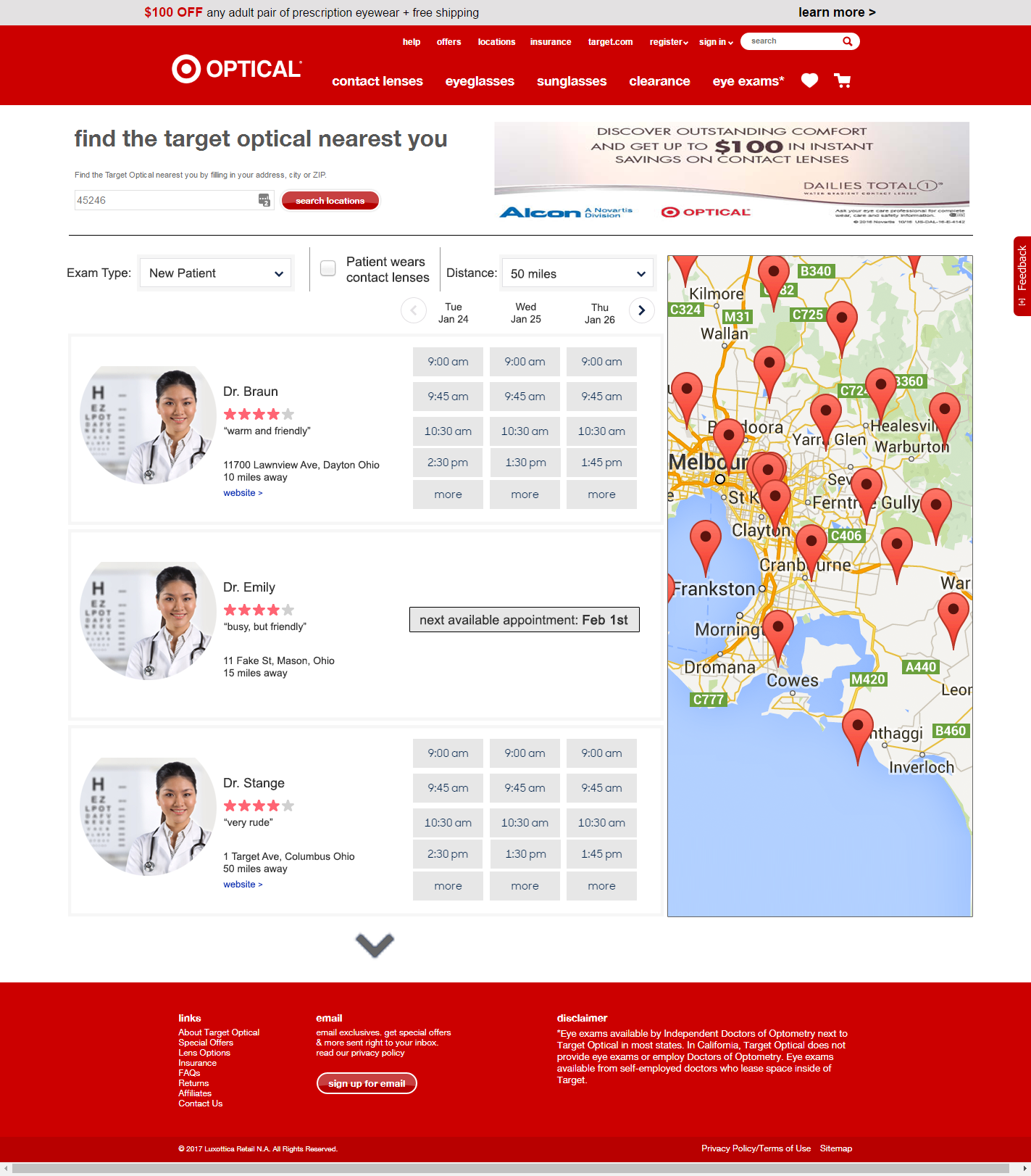
Proposed changes
- Complete overhaul of result presentation
- Reduction of the amount of whitespace
- Expanded the displayed information
- Adjusted the map to be informative but less intrusive, but also expanded it to allow for more at a glance information
- Brought the availability to first step, giving users the important info right away
- Added ways to adjust/filter search
Close up: Search Filters
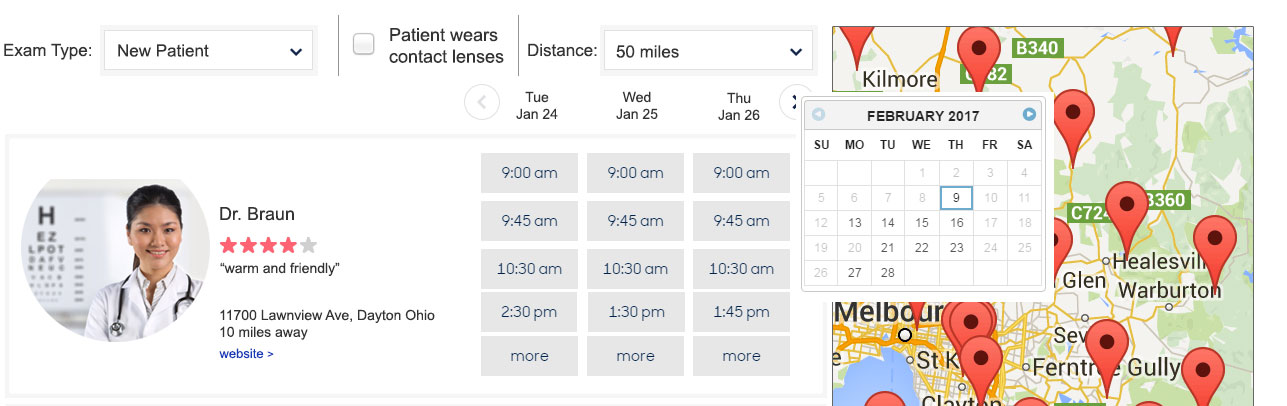
Proposed changes
Allowing the user to narrow their search is a good thing, It gives them some control, and can help with feeling overwhelmed as well as providing a critical connection point. They chose the location or doctor, which can help reduce no show appointments. When I searched for an exam I wanted to be able to refine my results that fit to me. Since I couldn't even tell what the radius was, I wanted to try to solve for that.
- Filters: Added 3 basic filters are shown but can be expanded if the map is moved down to accommodate more ways to filter. The results below the filters will default to nearest location but based on the filter choices (if any) the results will adjust.
- Exam Type: This would be a drop down menu with choices that would sort results. For example, if the user choose "new patient" only the doctors accepting new patients would display. Options appearing the dropdown would be flexible and could be dictated based on business needs. For example; one of the options should be "urgent" and the results would then adjust to show only the doctors and appointment times available for urgent type appointments.
- Patient wears contact lenses: This was separated out because contact lens exams require more time. If a user clicks this box the exam times displayed for the doctors should adjust for the extended time allowed.
- Distance: This should appear on any and all location searches. Users want to be able to dictate their search area. Some are okay travelling 50 miles for the time/item they want and for others anything more then 5 miles away is a hassle.
Close up: Appointment Times
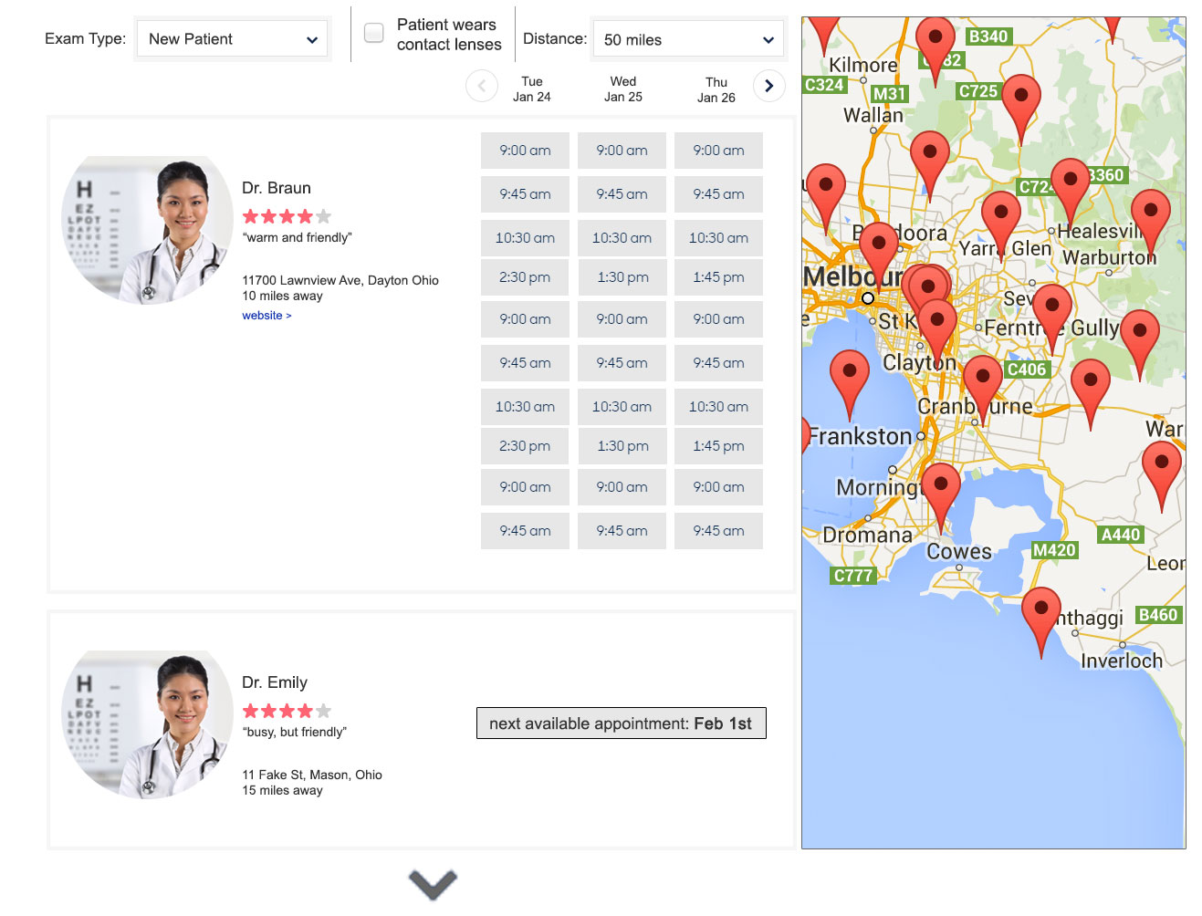
Proposed changes
I wanted to cover if the doctor had a lot of availability. Many Eye Exam appointments can be handled in 15 minutes, so if a user looked far enough in advance they would see a lot of appointments.
- Available times would apear in configurable amounts
- Initial glance woud show 4 available times per day, with a "more" at the bottom to indicate more times
- When "more" was selected the box would exand downwards, showing 10 total times
- If more times were available beyond the 10, "more" would appear again, and the box would expand again
Booking [before]
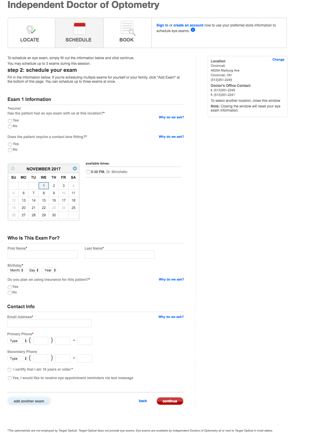
Current
- Lots of empty space
- Only here do we see the open appointments
- Standard Form, bit boring, looks really long
- No header banner, no footer, complete loss of branding
Booking [after]
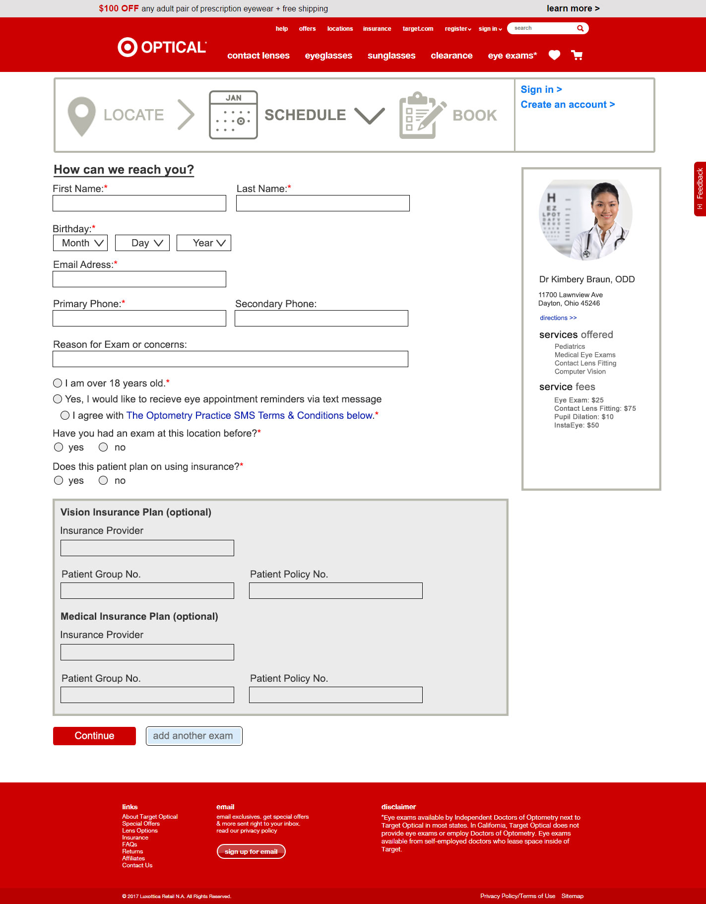
Proposed changes
- Form is much more condense, gives the sense that it will not take long to fill out
- Added the Header/Footer back into the page to give it the brands feel, otherwise You might have been on a fake or phishing site
- Added more to the doctor/location block
- Carried through the doctors picture to give it a connected feel. I want to see the person who is going to be doing my exam
- Added important info like services offered and potential fees.
- Potential Idea: Add DR reviews here to add more comfort
- Updated flow icons to match steps a bit better
Conclusion
My goal in this overhaul was to make the eye exam flow a bit more user friendly, but also to increase the feeling of connection and comfort. People go to Target because they feel like it's a comfortable space, the eye exam flow felt much more clinical and detatched. I aimed to resolve that as well as provided more indepth functionality.